
The document discusses various ways statistics can be misused, including biased study designs, data manipulation, and misrepresentation of averages. It provides examples of how sample sizes can be inadequate, how survey questions can be biased, and how graphs can be manipulated to mislead readers. The importance of using appropriate statistical measures, such as mean, median, and mode, is emphasized to ensure accurate representation of data.
Activity 2.1.2 Student Response Sheet
Part I: Answers
Example 1:
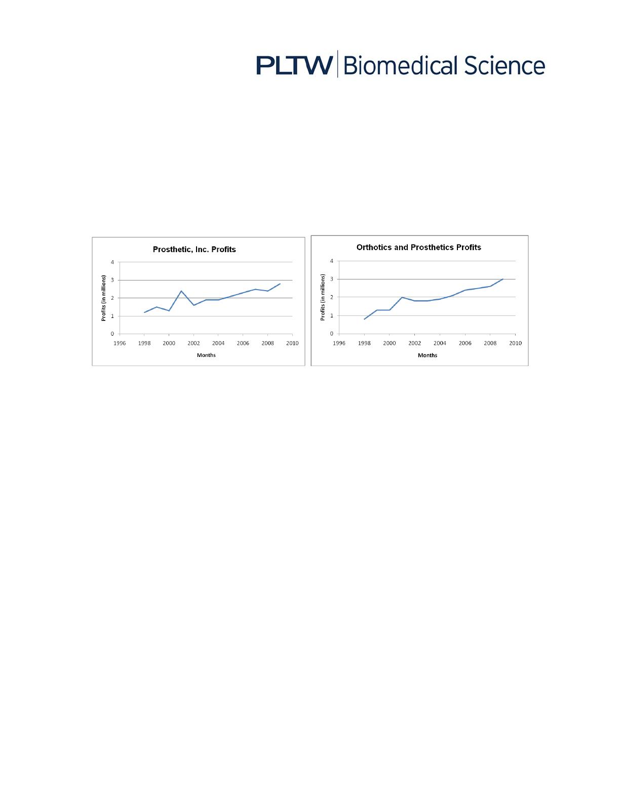
Prosthetic, Inc. and Orthotics and Prosthetics had almost identical profit increases
between the years 1998 and 2009. The y-a is on Orthotics and Prosthetics’ graph
has been altered to have a larger range than the range used for the y-a is on
Prosthetic, Inc.’s graph. If the same range was used for both graphs, they would look
as follows:
Example 2:
ABC.com presented that the average blood sugar level before meals for Americans
is 142 mg/dL but did not specify how the average was calculated. What they did not
share was that the mean, or arithmetic average, was calculated from a sample size
of only four people. Of these four people, all of the blood sugar levels (before meals)
were in normal ranges and one person had a blood sugar level of 240 mg/dL,
causing the entire group’s average to be skewed. Therefore, 75% of the blood sugar
levels of the people in the study were actually far below this average. A better
average to use would have been the median blood sugar level (i.e., the blood sugar
level in the middle of the data range). The website should have reported how many
people were included in the study. Four people do not accurately represent the
entire population.
Example 3:
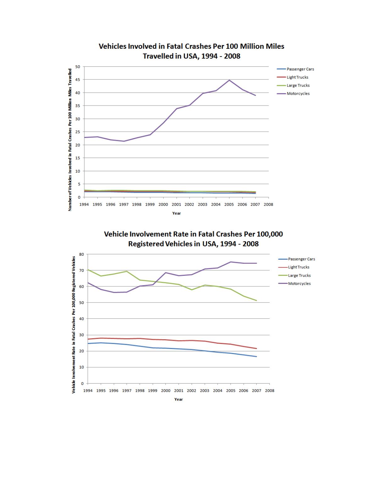
The data presented was biased as it did not present all of the pertinent information.
The number of motorcycles on the road is significantly less than the number of
passenger cars on the road, so simply using the number of vehicles involved in fatal
crashes is not enough to illustrate which vehicle is the safest. The following two
graphs, which show the rate of vehicles involved in fatal crashes per 100 million
miles travelled and the rate of vehicles involved in fatal crashes per 100,000
registered vehicles, represent the data more accurately. Using all of the data as a
whole, passenger cars are actually involved in fewer fatal crashes than the other
vehicles.
© 2011 Project Lead The Way, Inc.
Biomedical Innovation Activity 2.1.2 Student Response Sheet – Page 1
© 2011 Project Lead The Way, Inc.
Biomedical Innovation Activity 2.1.2 Student Response Sheet – Page 2

Part II: ays in hich Statistics Can Be Misused
Biased Study Design
Note: A sample is defined as a representative part of a population whose properties are
studied to gain information about the whole.
1. Sample is not representative of the entire population being studied.
Example _____
Example _____
2. Sample size is too small to accurately represent the entire population being
studied.
Example _____
3. Study design is flawed.
Example _____
4. Survey questions can be manipulated by the researcher so that the
participants are more likely to answer in a specific way.
Example _____
Data Manipulation
1. Researcher over-generalizes conclusions drawn from study results.
Example _____
2. Unfavorable data is not presented.
Example _____
3. Values, such as percentages, are used to present data without indicating
what the numbers actually mean.
Example _____
4. Causation is implied from the results of a study that only found a correlation
between two variables.
Example _____
5. Averages are often used to present the “normal values” of a set of data, but
they use an average that is inappropriate for the data set and therefore
misrepresent the data. The word “average” has a loose meaning. Mean,
median, and mode are all types of averages, but all have different meanings
© 2011 Project Lead The Way, Inc.
Biomedical Innovation Activity 2.1.2 Student Response Sheet – Page 3


